tide pods repackaging
graphic design, packaging design
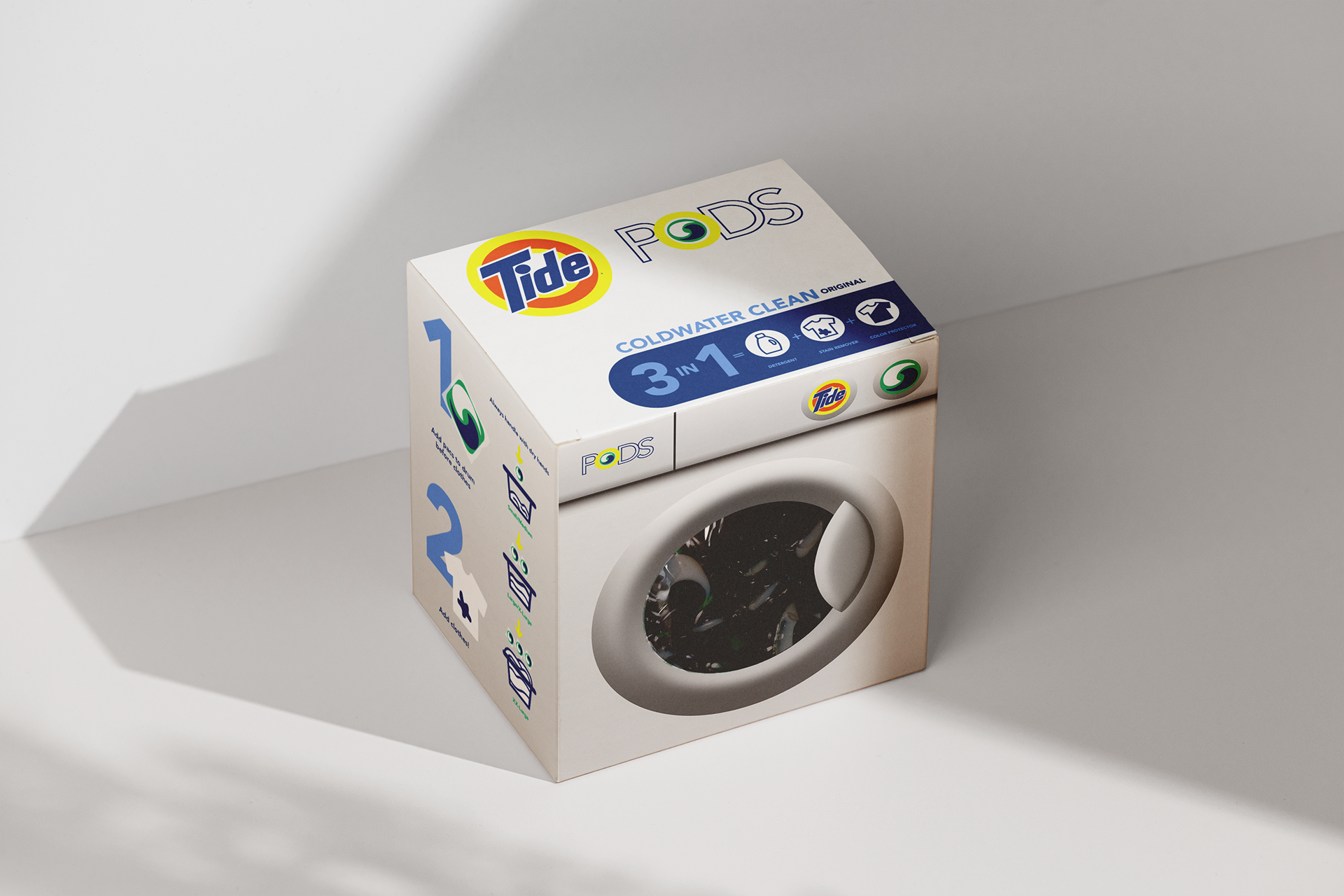
This Tide Pods repackaging project reexamines a familiar household product through the lens of sustainability, accessibility, and visual clarity.
The goal was to redesign the packaging in a way that reduces plastic consumption while improving user understanding and safety. The new system transforms a traditionally bulky container into a slimmer, sustainable format with clearer hierarchy, transparent sections for visibility, and simplified iconography.
By rethinking color, material, and typographic structure, the design aims to shift the product’s presence from loud and commercial to intentional and responsible.

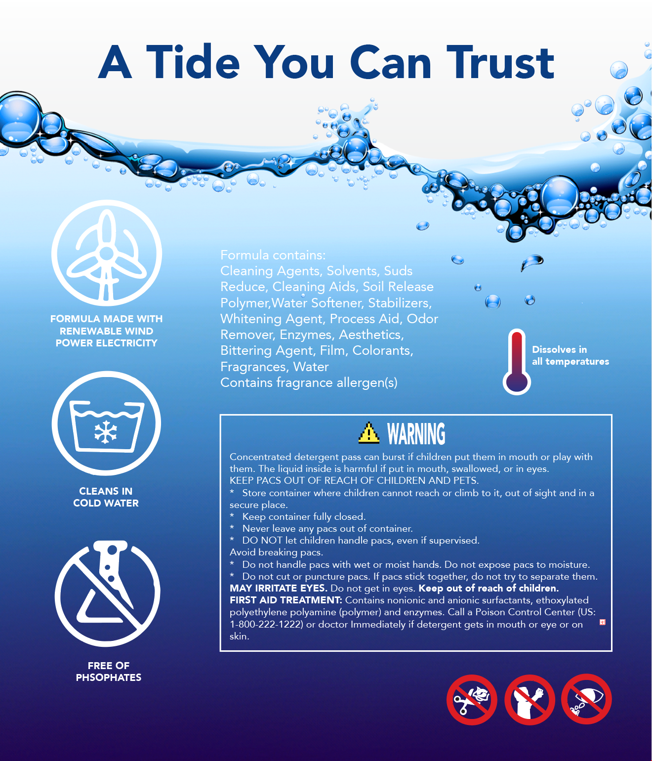
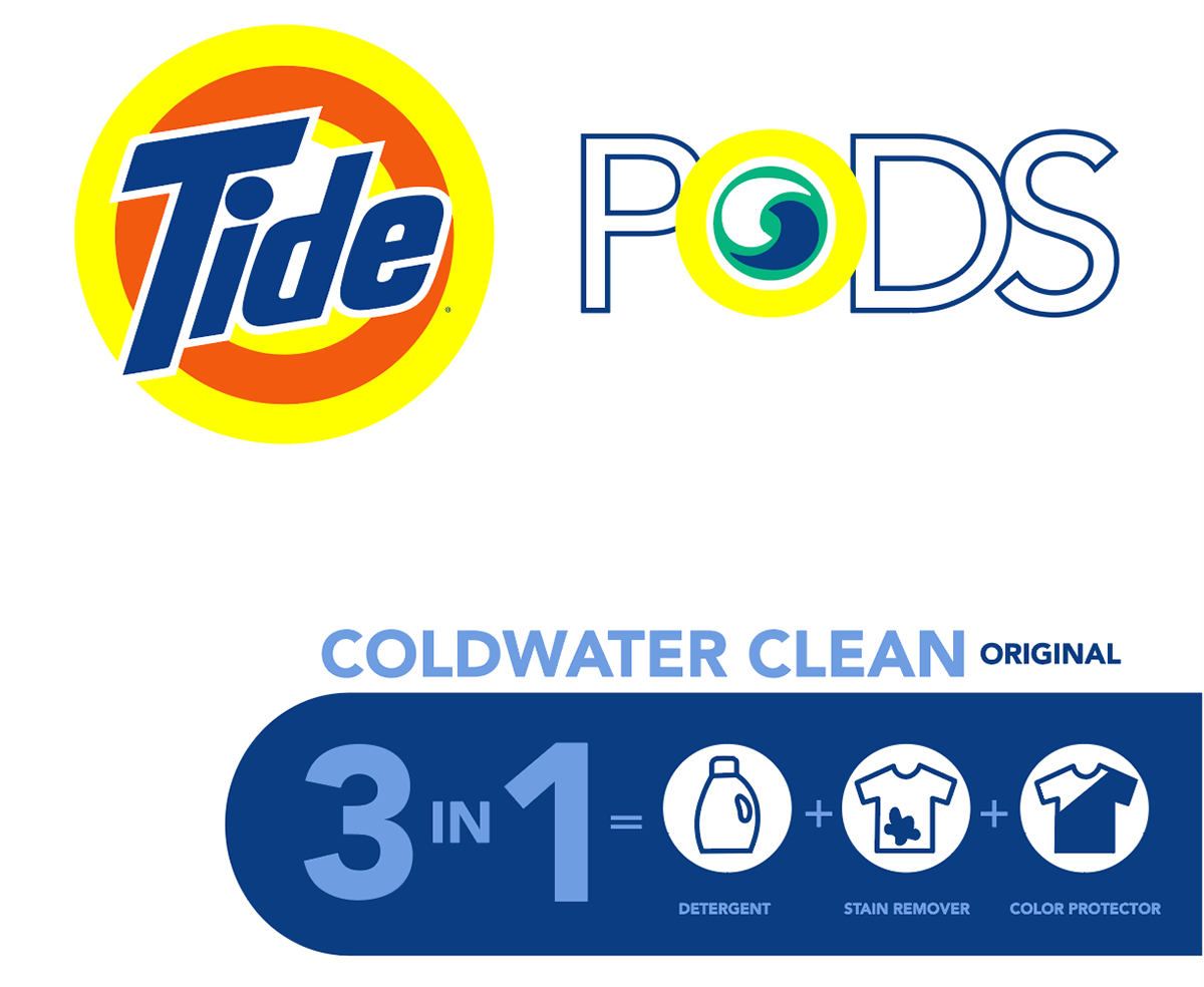
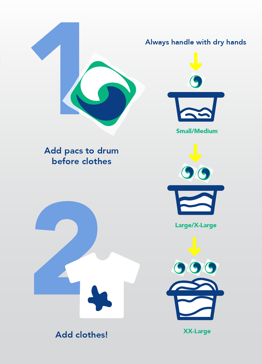

Final graphic system integrating updated typography, color, and iconography for a cleaner, more transparent brand identity.
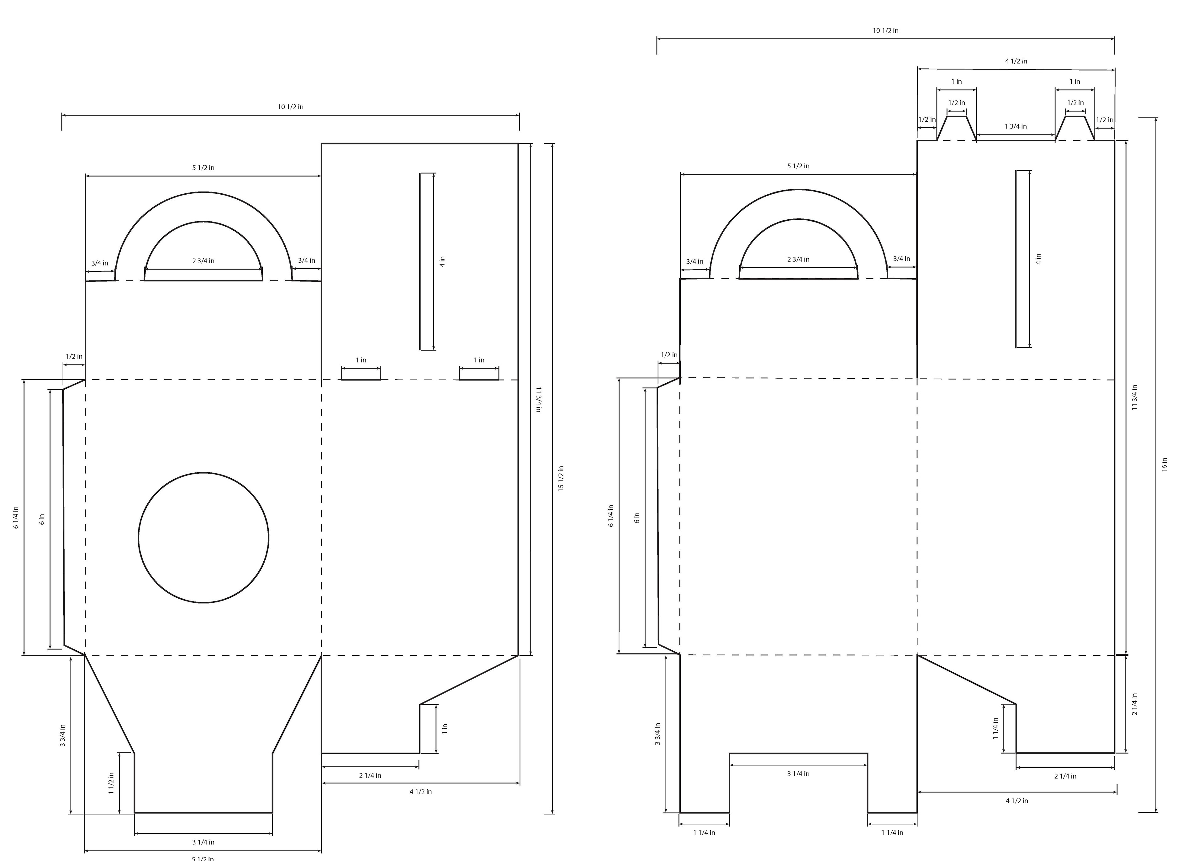
Designed dieline system.